Lake Superior Bathymetric Map
Even though I grew up in Wisconsin, I have not explored much of Lake Superior. This summer I was lucky to be able to travel to Madeline Island with my family and stay in the cutest A-frame cottage on the shore of Lake Superior. It was late-season, for the island, so the town was quite. We mostly enjoyed the lakeshore in front of the cabin, took out a tandem kayak for a quick paddle along the shoreline, and sat on the porch, enjoying cooler temps and smoke-free air (exciting for me, since Idaho was incredibly smoky this summer, from all the wildfires). Anyhow, all that to say, I need to spend a whole lot more time exploring Lake Superior - specifically the lakeshore! (The waves are capable of getting far to big for my kayaking comfort level.) This map was a way for me to explore the area from Idaho, holding me over until I get to return, hopefully for a much longer trip.
Bathymetry is technically “the measurement of depth of water in oceans, seas, or lakes.” It’s like a topographic map of the bottom of a body of water - allowing you to see the relief of the lake bed. This map lets you see the watery depths of Lake Superior, using varying shades of blue to communicate water depth. The deepest point is in the southeast part of the lake, and at 405 meters it comes in as the third-lowest spot in North America. Of interest to anyone who’s considering paddling on Lake Superior, storms can cause swells of up to 20 ft!
The lake is wreathed in recreation areas, including national parks (Isle Royale National Park in the US, and Pukaskwa National Park in Canada), provincial parks (Sleeping Giant, and Lake Superior), as well as Pictured Rocks National Lakeshore, Apostle Islands National Lakeshore, and Porcupine Mountains state park.
Shop Lake Superior Bathymetric Map
Keep scrolling for more pictures and details on the process!

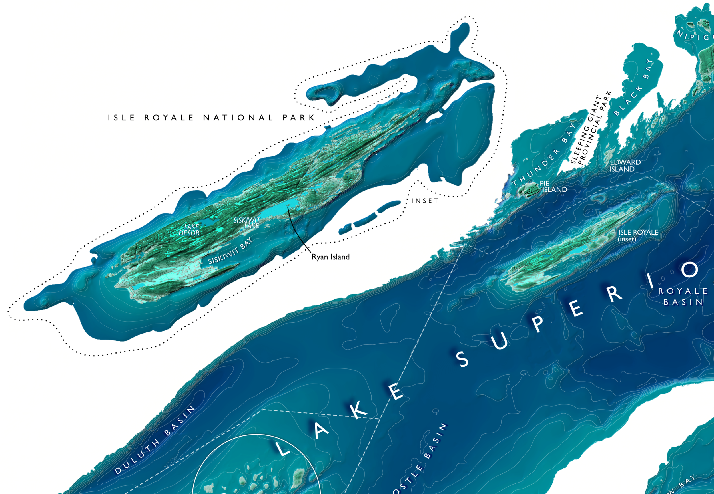
Isle Royale National Park
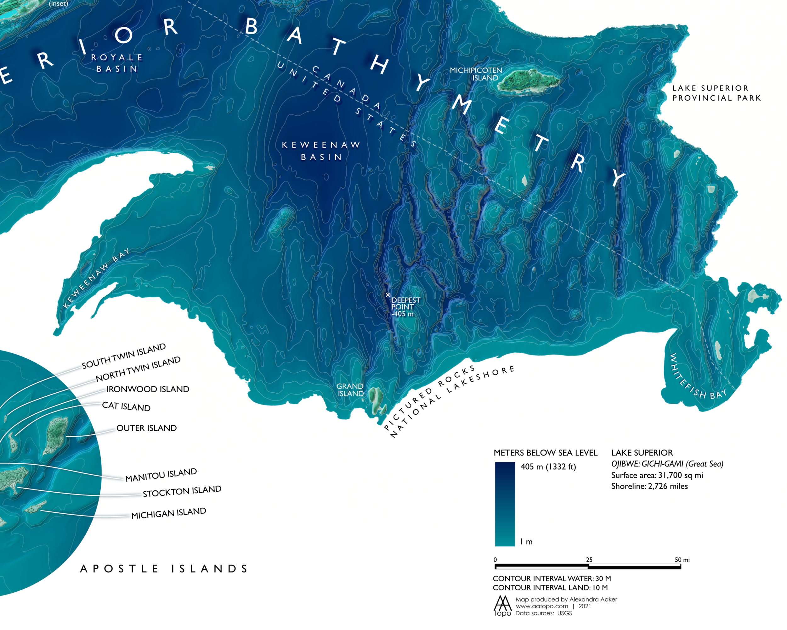
Lake Superior Bathymetry - Deepest Point
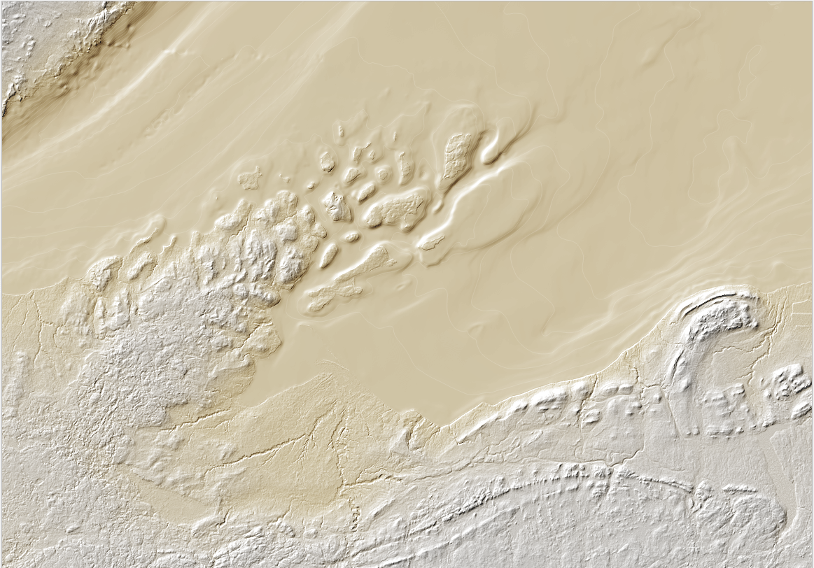
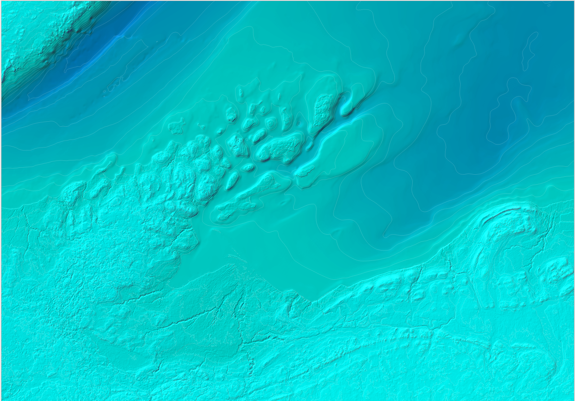
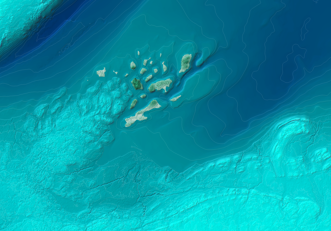
A glimpse into the process. Starting with bathymetric hillshade data, I applied a gold/brown color scheme, to suggest the muddy lake bottom (this layer will come through subtly after the next two colors are layered on). Next two different blue gradient color schemes are applied, to achieve the watery effect. The color schemes are classified based on the elevation of the data point - darker colors correspond to a deeper elevation, and vice versa for lighter colors. With projects like this, it helps that the data is so beautiful to begin with. The earth is amazing!